Living The Promise is a comprehensive campaign dedicated to raising funds to support UCR students, faculty, research, programs, and facilities, and is driven by campus academic priorities. The campaign public phase began in October 2016 and will conclude in 2020. Learn more about Living The Promise.
The campaign’s logo of a sunburst and a rich, vibrant color palette seek to convey the characters of a diverse, vibrant, and innovative campus. If you are a member of UCR Development and are interested in obtaining a campaign template toolkit, please contact our office.
Living The Promise assets may only be used for purposes of the Living The Promise campaign.
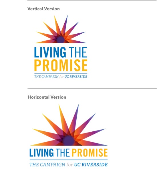
Logo and Starburst
Living The Promise is visually identified through a customized logotype. To reproduce any of the elements in promotional material, approved artwork files must be used and not altered. The words used in the logo (LIVING THE PROMISE, the Campaign for UC Riverside) have been created as original artwork and cannot be represented by fonts; the logo should never be hand-typeset.
The campaign brand is represented by two main elements: “LIVING THE PROMISE”—which locks up with “The Campaign for UC Riverside” slogan—and the Starburst. The starburst is a customized design based on the starburst that forms the counter (open space in a full or partly closed area within a letter) of the R from the UCR main logotype.
Logos should not be altered by change in size, proportions, colors, relative relationship of design elements or by special effects. Logos may not be altered or locked up with new tag-lines or other design elements, which in effect would create an unofficial logo.
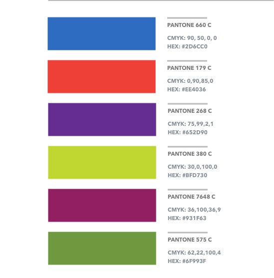
Campaign Color Palette
Colors play a very important part in the Campaign for UC Riverside Identity. They represent a rich, vibrant, fun, innovative, young, creative, and diverse culture. The palette is based on six primary colors. Each color has been assigned to a specific Campaign Theme. These rich colors work better when combined with clean design and big use of white space.
The Campaign Palette is based on the UCR blue and gold, plus six rich and vibrant additional colors.
*PANTONE is Pantone, Inc.’s check-standard for color reproduction and color-reproduction materials.
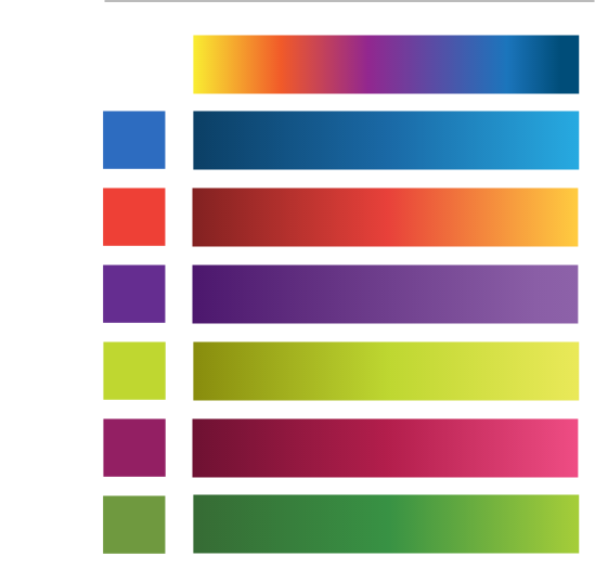
Campaign Gradients
These gradients should be use as a reference. Each one is associated with a primary color and represents one of the Campaign Themes.
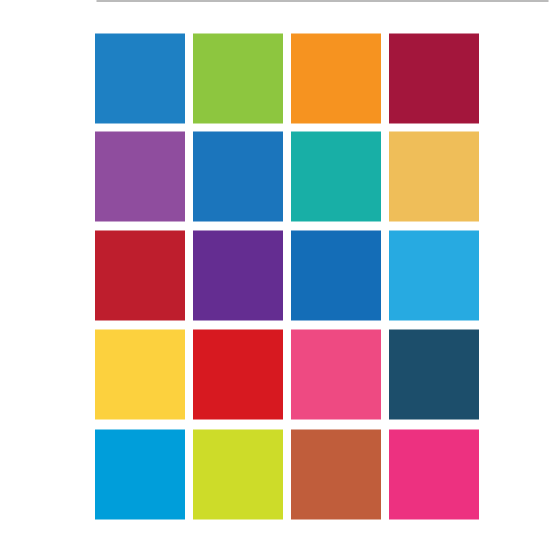
Extended Palette
The extended palette has been created as a reference for combination with the Primary colors. These colors don’t have to be the same values, but can serve as a guide when designing printed pieces.


