The UC Riverside primary logo should be featured on official campus print and digital collateral and communications channels. It is available in both horizontal and vertical applications. As one complete digital artwork file, this customized logo is NOT a font and should not be recreated using standard fonts or inserted into text. When the university’s name appears in copy, it should be spelled out as “University of California, Riverside,” “UC Riverside,” or “UCR.”
visit the downloads page to access UCR's Campus Brand Toolkit
UC Riverside Primary Logo — Horizontal
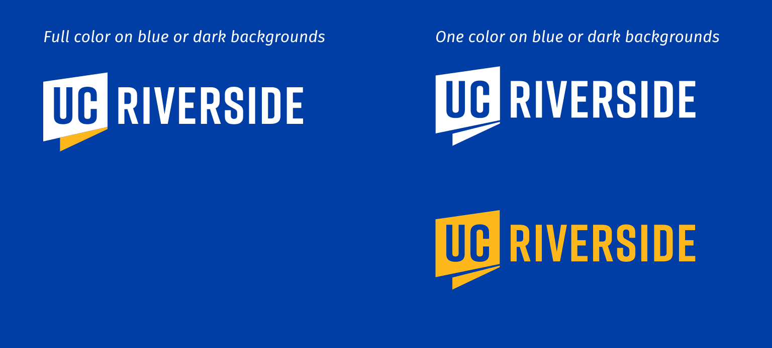
For all applications, the primary logo (horizontal) must be displayed in colors specified to the right. Whenever possible, it should be used in the approved UCR gold and UCR blue colors. When only one color is available or the background does not lend itself to the two-color rendition, there are two one-color versions that can be used: UCR blue, and UCR yellow. The logo can also be reversed to white over a background.
For special cases, the logo can be used as grayscale/black, and black.
Access UCR's Campus Brand Toolkit:
UC Riverside Primary Logo — Vertical
For all applications, the primary logo (vertical) must be displayed in colors specified to the right. Whenever possible, the primary logo should be used in the approved UCR gold and UCR blue colors. When only one color is available or the background does not lend itself to the two-color rendition, there are two one-color versions that can be used: UCR blue, and UCR yellow.
The logo can also be reversed to white over a background. For special cases, the logo can be used as grayscale/black, and black.
UC Riverside Primary Logo — Black and Grayscale
When only one color is available or the background does not lend itself to the two-color rendition, there are two one-color versions that can be used, as shown to the right: grayscale or black.
Primary Logo — Area of Isolation
It is recommended that the institutional logos have a minimum amount of clear space isolating them from other elements. This area of isolation, or minimum recommended clear space is identified here to the right.
Primary Logo — Minimum Size
To ensure the institutional logos are clearly legible, it is recommended that they not appear smaller than the minimum size requirement shown here to the right.
Primary Logo — Common Misuse
The primary logo exclusively establishes UCR’s distinct identity. To clearly communicate the goals and vision of the university, the identity must be displayed consistently according to the guidelines in this manual. Some applications may require deviation from the identity guidelines. In these cases, such as imprinting the logo on clothing, an exception or waiver may be requested by contacting University Relations.


