In addition to logos, colors are an important recognizable aspect of brand identity. UCR’s brand colors reflect a diverse and young campus. Consistent use of UC Riverside brand colors ensures our communications establish a shared identity among UCR students, faculty, staff, alumni, and the local community, and visual recognition nationally.
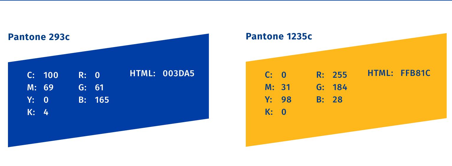
The university's primary color palette is an important asset in establishing a unified, consistent identity. Our primary palette uses UCR blue and UCR gold.
UCR Primary Colors
The primary colors of the UC Riverside visual identity are shown here. The dominant color should always be Pantone 293c complimented by Pantone 1235c.
For contrast or visual depth, Pantone 660c and 130c may be used. These colors may not be used alone or substituted for the primary colors.
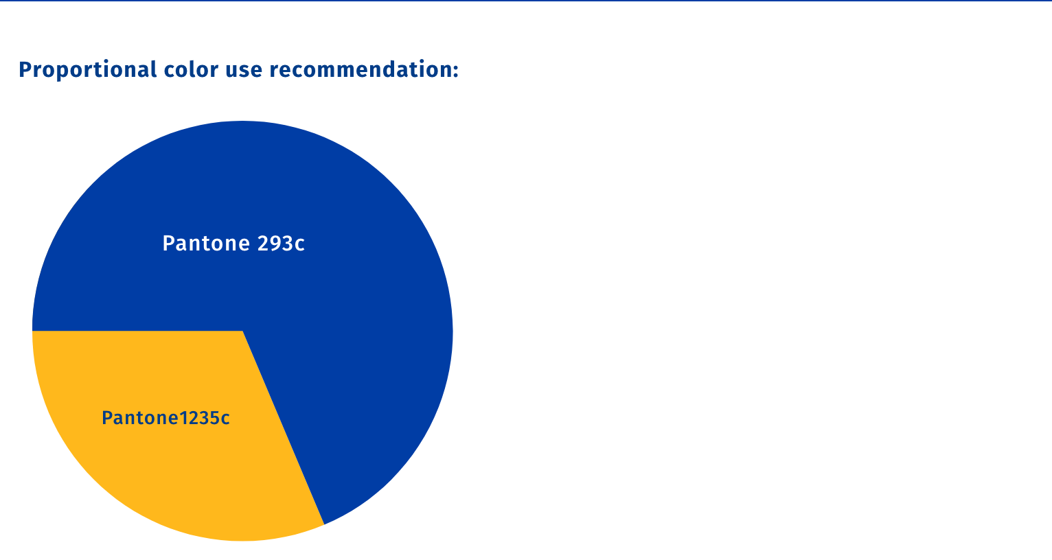
Proportional color use recommendation is shown in the pie graph to the right.
NOTE: Pantone® is a registered trademark of Pantone, Inc. Due to the inconsistent nature of monitors, screens, and desktop printers, please refer to the specific Pantone number when specifying or proofing color. All CMYK, RGB, and HTML values shown here are provided by the Pantone color manager and may not match Adobe or other alternate ways to specify such color values.
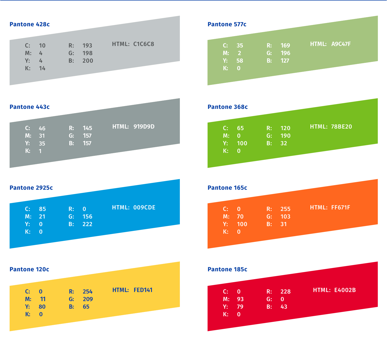
UCR Extended Color Palette
The extended color palette is intended to add a range of diverse colors for use in collateral and various other university communications. They are intended to be used with, and in compliment to, the primary color palette shown above.


